How to Use Opentype SVG Fonts in Photoshop
Traditionally, fonts were limited to one solid color, were only vector shapes, and had no variable transparency. Opentype SVG changed all that by using images instead of vector shapes. Suddenly, you could keep all the natural texture and detail of the original lettering making the text you type actually look like it was handwritten.
While there is no universal consensus on a color font format for operating systems and browsers, Opentype SVG seems to be leading the charge with its versatility for designers. We’re going to show you how to use these fonts in Adobe Photoshop. Please note that Opentype SVG was not always supported by Adobe. You need to have Photoshop CC 2017.0.1 or higher to be able to use these fonts. We always recommend installing the latest update, as later versions have come with performance and rendering improvements for these SVG fonts.
Example Opentype SVG Fonts
First Step: Anti Aliasing
With your font loaded up in Photoshop, the first thing you want to look at is the anti aliasing options. The different options will affect how to text renders within your document. With the text tool selected, you’ll see this menu above your document, with the anti aliasing mode to the right:
At the time of writing, ‘Sharp’ is a mode you typically want to avoid. If your SVG font doesn’t seem to be working, this may be the culprit. ‘Sharp’ disables the SVG images, and chooses the vector version underneath instead. In other words, you’re getting a vector font which defeats the point of Opentype SVG fonts.
‘Smooth’ is the most traditional and least invasive of the options and is the mode I’d recommend. It renders and scales the font is the same way you’d expect an image to. Later on, you can always add some sharpening to fine tune things. The other options, ‘None’, ‘sharp’ and ‘crisp’ all work in similar ways, and add some post processing sharpening to your text. Expect more defined edges, and a bit of a grainy/jagged look. This works great for legibility, but looks quite digitized.
Performance Considerations
Each letter in an Opentype SVG font is an image, so keep this in mind with the amount of text you’re working with, and scaling your text. A paragraph of text can be over a hundred images, so your computers processor may be a little overwhelmed if you’re trying to scale a few blocks of text. Opentype SVG fonts tend to come paired with traditional vector fonts of the same lettering, so an option is always to use the vector text until you have the scale exactly the way you want. When you’re done scaling, rotating and everything else, change the font to the Opentype SVG version.
Choosing a Font Color
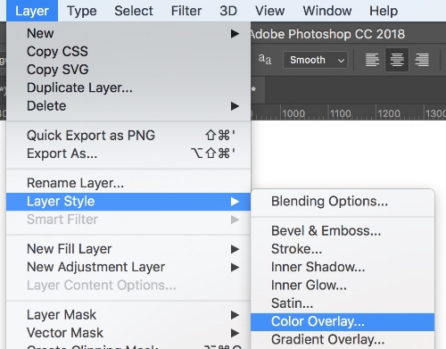
Opentype SVG fonts handle color a little bit differently. Using the text color selection tool has no effect in Photoshop, and so we use the color overlay tool.
In the layer menu under layer style, select ‘color overlay’.
With blending mode set to ‘normal’ and opacity set to ‘100’, select a color of your choice and it will apply to the text.
Adjusting Opacity
With Opentype SVG fonts having control over transparency/opacity, there is a chance your text doesn’t stand out as much as you’d like it to, even with opacity at 100%. A quick option is to duplicate your text layer, which will thicken things up.
Rasterizing and Sharpening
When you have the text looking exactly the way you want it, it’s time for some finishing touches. Since SVG fonts are images being scaled up and down, chances are there is a little bit of a ‘blur’ you want to clean up. First up, right click on your text layer in your layers panel and choose ‘rasterize layer’, effectively turning your text into a traditional image. With the text rasterized, you can now apply sharpening effects. Go to ‘filter’ in your top menu, then to ‘sharpen’, followed by ‘smart sharpen’. Play around with the values to get the look you want. A subtle sharpening is always a good idea, but you can really affect how the texture looks with some more extreme values here. With some Opentype SVG fonts, sharpening really gives the font a whole new level of dynamics.


